amazon go
As a visual designer on the Amazon Go creative team, I played a pivotal role in developing both digital and print assets that supported the rollout of a fresh new brand identity. This store was the first to showcase updated branding, a new store layout, and and a brand new Made to Order menu. Collaborating closely with marketing partners, the store design team, and various vendors, I ensured that every element was cohesive and aligned with the updated vision.
My role
Visual Designer
credits
Creative Director: Dana Deininger
Copywriter: Drew DiSabatino
Creative PM: Leah LaMoure
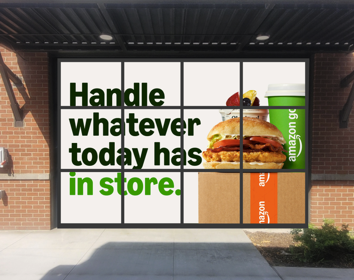
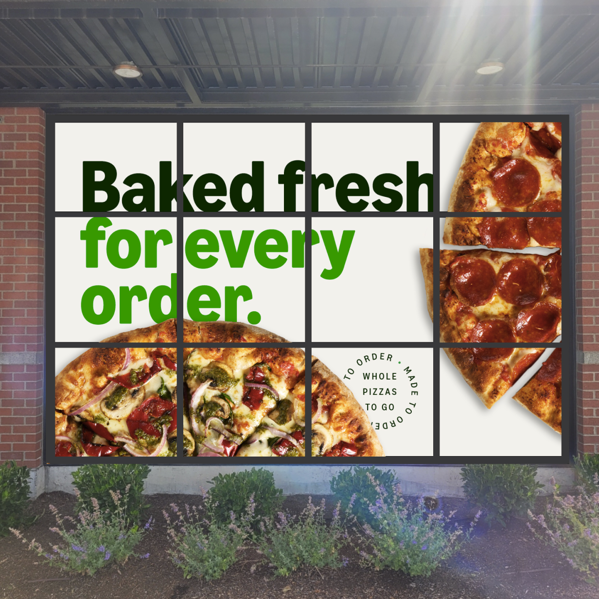
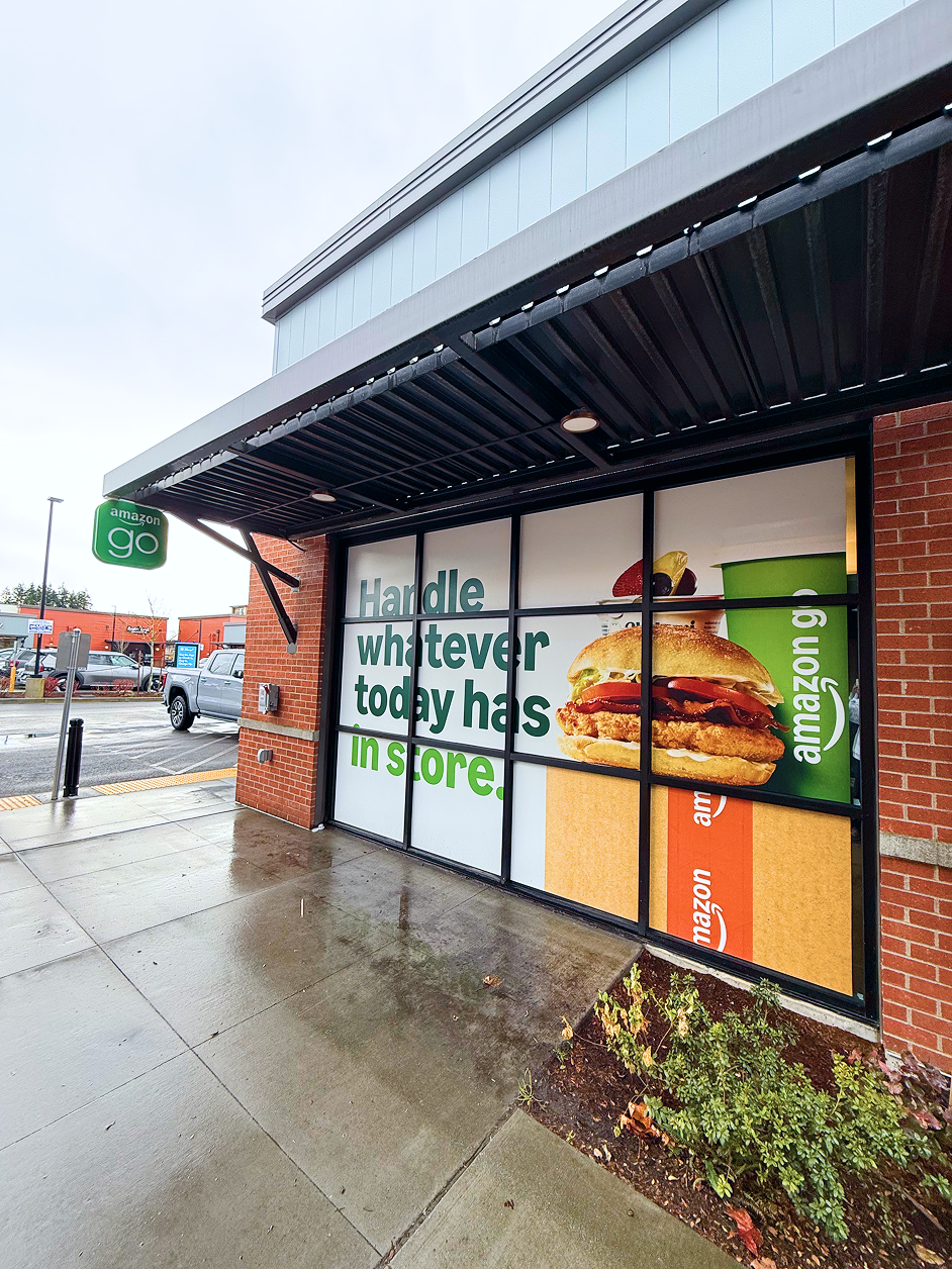
exterior windows
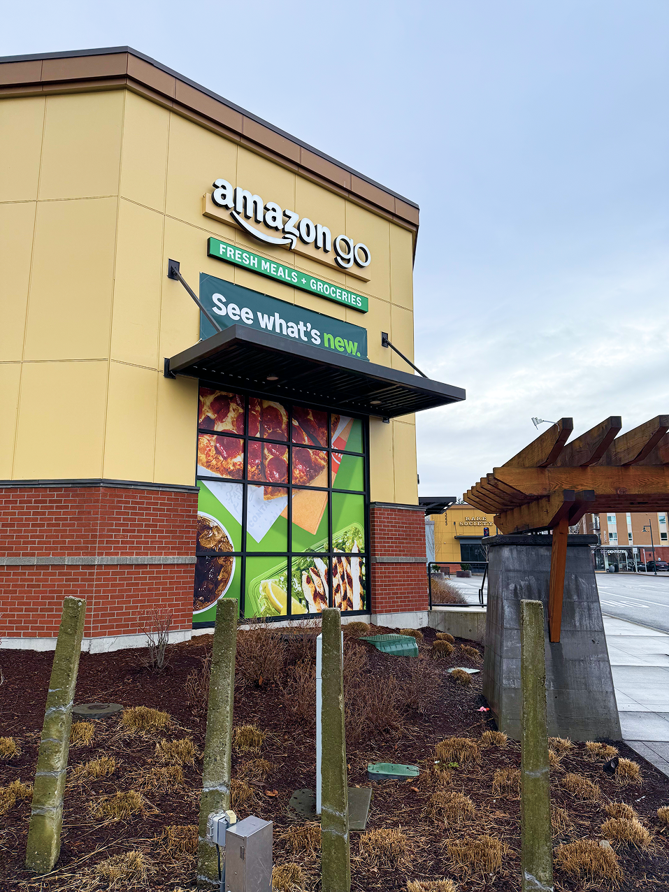
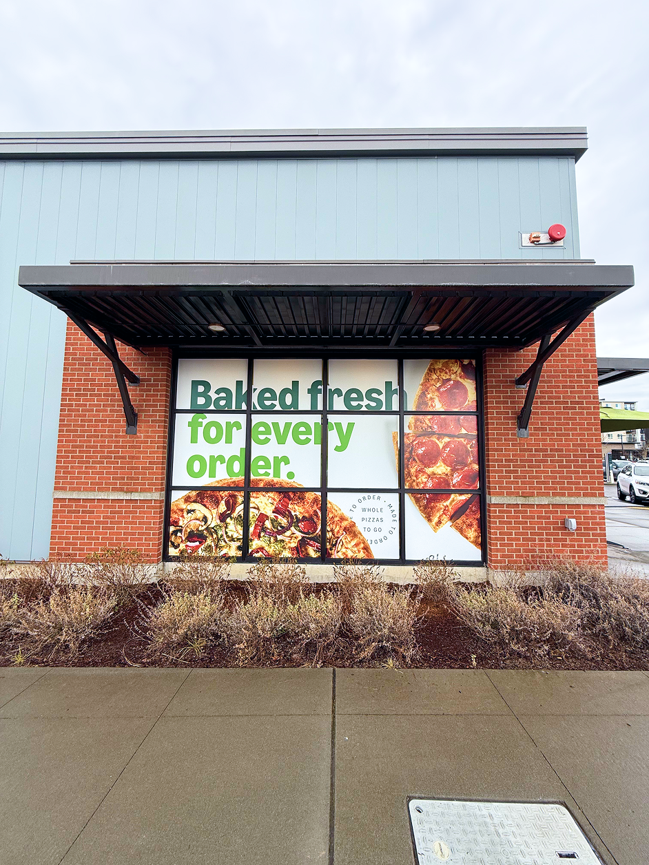
Window placements facing the exterior of the store played a crucial role in attracting new and existing customers. Included were three large window displays, located in high traffic areas which provided visibility and drew in potential shoppers. The front facade highlighted the various categories of products available as well as Amazon services, showing the store as a complete one stop shopping destination.
Digital Menu Board
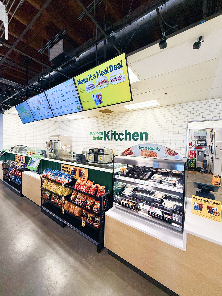
The redesign of the menu board system was initiated to support the introduction of new items to the menu. Originally, the design featured two screens; however, the expansion to three screens allowed for a more streamlined presentation. Each screen was organized to reflect specific dayparts, tailoring the menu to display breakfast, lunch, and dinner.
This structured approach enhanced the customer experience by providing relevant options based on the current meal period. The fourth screen was dedicated to promotional and marketing slots, allowing for dynamic advertising and special offers to be displayed without interrupting the primary menu presentation. Overall, this redesign supported better visibility of menu items while also promoting ongoing marketing initiatives.
Breakfast
Lunch
Dinner
Marketing/Promotions
Bakery Case
The new bakery case fixture offered an innovative design that allowed for various messaging placements, making it possible to effectively feature new partner vendors, a diverse array of products, and relevant promotions whenever they were needed. This flexibility supported the marketing efforts of the vendors and enhanced the overall shopping experience.
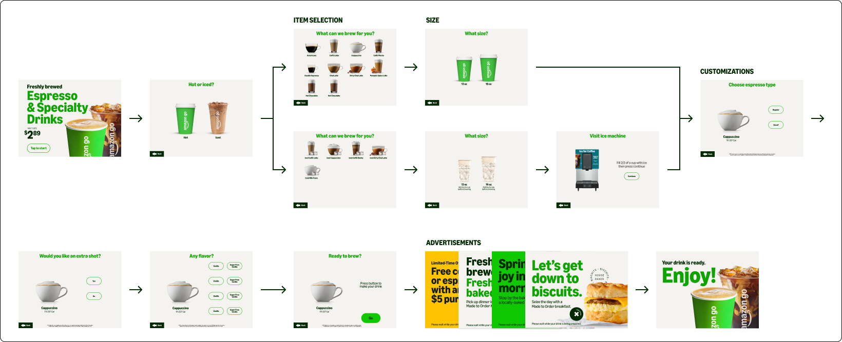
Espresso and coffee machine UI
The espresso and coffee machines was another focal point of the new branding initiative, showcasing an updated color palette and font that seamlessly integrated with the overall store design. The new aesthetic not only elevated the coffee experience but also reinforced the brand identity, capturing the attention of customers.
Espresso
Coffee & Tea
Static Ads
